Tuesday, December 1, 2015

Monday, October 19, 2015

Charcoal and Graphite Thumbnail Landscape


You may wonder what is a thumbnail drawing.  A thumbnail drawing is a small scale drawing that is done very quickly to place down the general features of a subject.
I like to use thumbnail drawings to have a idea as how it may look as a whole on a small scale.
Thumbnail drawings are very resourceful in the fact that you can refer back to the ideas you intended to capture or focus on.  Also thumbnail drawings help you save on the cost of materials you use because that are small.  By doing a thumbnail drawing you will have basically your blueprint for what your goal of your painting or drawing will look like.


Materials Needed

4B Charcoal Pencil
Blending Stump
Knead Eraser
Willow (Vine) Charcoal Stick
Gray and White soft pastel chalk
H, 2B Graphite Pencils
Ruler


Use a ruler to crop off your thumbnail 3"x4" inches.  
Next draw out your 6 range value scale with a ruler and an H graphite pencil.  
Then divide it into 6 squares. You will fill out each value scale using your 4B charcoal pencil, willow charcoal stick, gray soft pastel chalk, and white soft pastel chalk using your blending stump.  The darkest values with charcoal pencil 4B.  
The next value going from left to right you will use a willow charcoal stick then blend into paper with blending stump.  
Next use the same willow charcoal stick but this time use less pressure with just a few hatch mark and blend marks in to paper using you paper stump blender.
Next use your gray soft pastel and blend it into paper with stump.
Next use gray soft pastel and white soft pastel chalk.  Shade it using a hatch method into the paper and blend using blending stump. Also if necessary if range looks too dark from previous range, use your knead eraser to lighten the value up.
The last value scale use just a little press and a few marks using your gray pastel.  Complete the light range of value using the white charcoal applying heavy pressure and DON'T blend.
Finally, use your gray soft pastel chalk using the side of it to push into the paper to give it a gray tone.


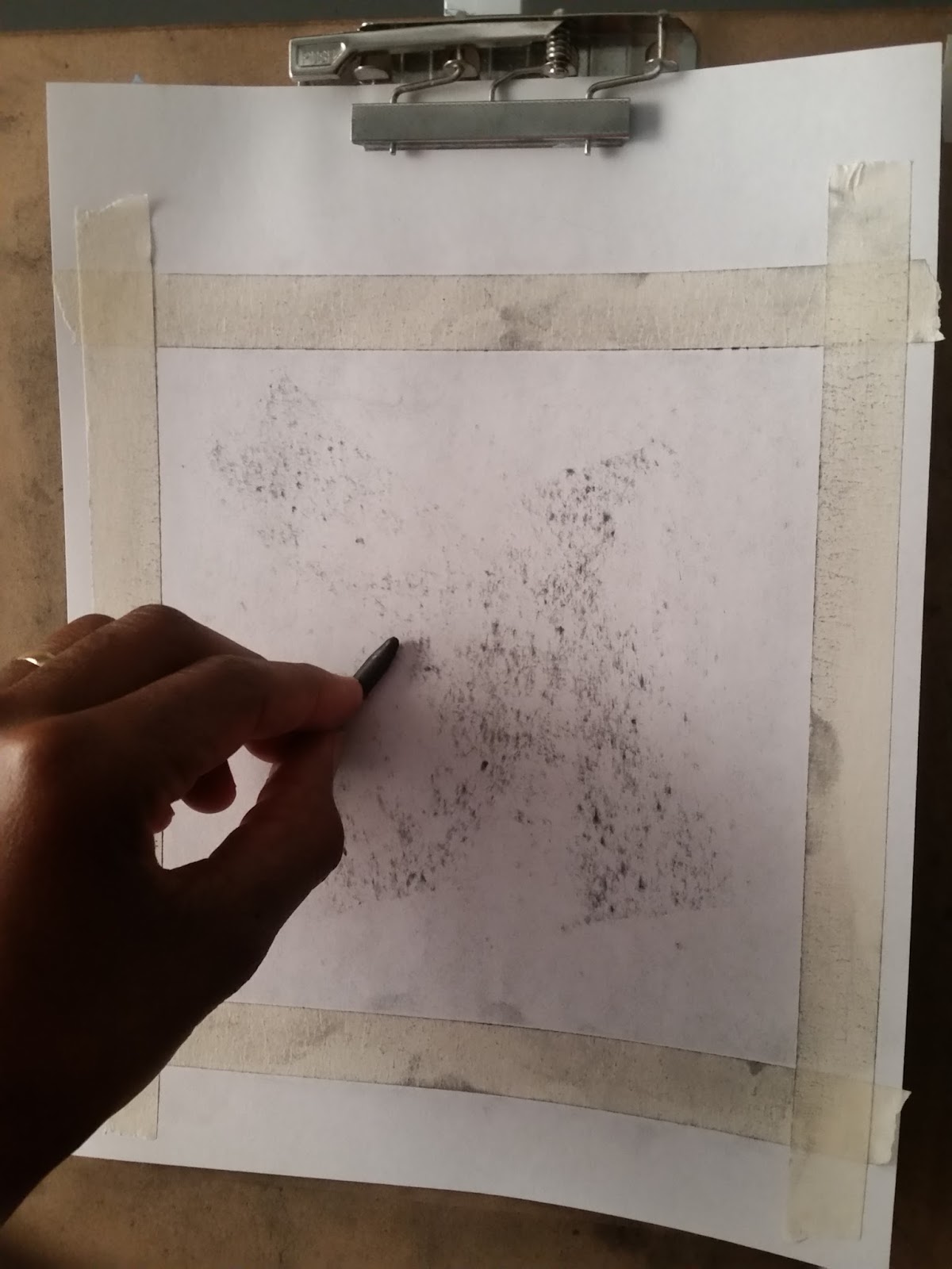
Use your 2B graphite pencil and produce your line drawing of you landscape.


Complete your thumbnail drawing referring to your 6 range value scale at the bottom of your thumbnail. Block in the negative shapes of your darkest values first from the foreground.  Progress to get lighter values as you proceed to the background.

I hope this blog on why I use and produce my thumbnail drawings have helped you.
Thank you all for taking the time to view my blog. 

Monday, September 28, 2015

Still Life Drawing in Charcoal


This is a still life drawing of a hair brush, bottle of Listerine and a barber brush. This drawing was done with  2H graphite pencil B4 charcoal pencil and vine charcoal.

Tuesday, September 8, 2015

Monday, August 17, 2015

Painting of a Storm on the Horizon


Oil Painting of a "Storm on the Horizon" © 2015 


This Painting was done last week.  I have always had a fascination with storms ever since I was a child.  I just really like it when the sun is out and there are dark clouds in the distant.  This painting I did out of that love of stormy weather. I hope you enjoyed this painting.  This painting is for all you storm lovers like me who truly love those beautiful lightning strikes. Thank you all for taking the time to view my blog. 
If you desire more details about this work or other paintings and drawings of mine then please email me deeweaver15@gmail.com.  Thank you.

Monday, August 10, 2015

Charcoal Portrait of Head Wrapped Woman


I have been drawing portraits for many years and I truly enjoy drawing with charcoal.
Last week I took the time to draw a portrait of a woman wearing a head wrap.  This is actually my fourth drawing of a woman wearing a head wrap.  I just find it very intriguing.  So I drew this lady with a head wrap.


The paper is white to began with but I file done some vine charcoal using sand paper right over the paper.  Then I use a chamois cloth and rub it all over the paper.  This gives the paper some value. By doing this it increases automatically your value range. The more value you have the more appealing to the eye it will be.


Next a vine charcoal stick to drawing in a simple line drawing of the basic form and angles.


As I continue to pull the charcoal around loosely I also add a little more detail to the line drawing.


Now when my line drawing is satisfying I began to add in some proportions and contour lines. I also lay out the future shadows planes of the face.


Now I began to work on adding values to the line drawing with the use of a cotton swab.  I always start adding the detail in first around the eyes then I work my away outward.


At this stage I continue to add more value you with each passage layering more charcoal to the paper making it more darker.  As you can see there has been allot of detail added to the drawing now.


I usually have the option of using a cotton swab or a paper stump to push more charcoal into the paper.  This blends it into the paper for either a subtle change in value as with a soft edge or a hard edge as in creating contrast in value.


I wanted to capture my use of extending a short piece of charcoal by using a string and a skewer.  I tie the short piece of charcoal to the end of the skewer.  This increases length and use of the charcoal. 


Here is the completed drawing with my signature.  14 x 17 on Bristol smooth vellum paper  
I used vine charcoal sticks and one 4B Generals charcoal pencil.

Thank you for visiting my blog site.  I hope this has been informing to you.
If you are interested in this work of art then please give me a email at deeweaver15@gmail.com or message me @ https://www.facebook.com/unique.artistry.3


Monday, July 20, 2015

Mixed Media Abstract Painting Process


It has been a while since I posted any abstract art on my blog.  This is for all you who love abstract art painting like me. I don't know if I shared this with you all or not but I really enjoy painting in abstract. There is so much freedom and such an opportunity to be spontaneous when creating abstract that you can never mess up.  For all of those who has every seen abstract paintings before and if your response has been, "how is this art?"  "I just don't get it."  Perhaps you also said to yourself,  "That's just a bunch of paint all over the place."  Well guess what? You are not alone.  I must admit that I was one of you who said the same things until I got educated on the elements of design.
There are so many elements and principles of design which are also used in interior decoration, fashion, architecture and ect.  My abstracts most of the time deals with 3 to 4 colors that compliment one another on the color wheel with there tints and shades.
My goal in my abstract painting is to invoke an emotion through the use of colors which excite the eye or grabs your attention. Basically, expressing to the viewer of my abstracts what these colors has done to me emotionally.
 My other purpose in painting abstract is the create  emphasis with the use of texture.  I just love texture in my abstract paintings whether it is broken up color through splatter or the use of a palette knife and many other ways.  I hope you enjoy the piece which was produced last week.                                                                                                                                                                                                                                                                                                                                                                                      


This is my reference thumbnail drawing done in prismacolor pencil.  The colors I used was purple, gray, lavender the tint of purple, baby blue, and a light dark aqua green.  If you are familiar with the color wheel these are secondary and tertiary color with one neutral which is gray.  By doing a thumbnail drawing design at the beginning it gives you a preview of which it my look like before totally committing to the color and composition.  However, in this piece later I deviated from the original composition and altered it some.                                                                                                                                                                                                                                                                                                                                                                                                                                         


I used canson watercolor paper and used liquitex matte super heavy gel which goes on white and can be mixed with paint.  In this case I applied the gel medium onto the paper.  I don't know if you can see the pattern or compostion drawn out on the surface with a pencil before there was paint applied. The gel gives the surface texture.                                                                                                                                                                                                                                                                                                                                                                                                                                                                                                                                                                                                                                                       


Next I added a light amount of  watercolors to the surface and I continued to add more color to darken it. I could have went dark to began with, but instead when I work with watercolors I start out light in tones of color.  You can see where the pattern or composition is going.                                                                                                                                                                                                                                                                                                                                                                                                                                                                                                                                              


I continue to add watercolors to the designated areas which was predetermined beforehand.  If you look closely you can see the texture coming through the colors.                                                                                                                                                                                                                                                                                                                                                                                                      
                                                                                                                                                                 

This is the final stage of the process as you can see there are colors that are broken up to produce more texture.  I added the same colors to the piece using only acrylic now.  I created my own stencil design out of watercolor paper which is stiff.  Your stencil has to be stiff enough to hold its pattern or design. I used a filbert bush and large round brush in the final stage.

Thank you all for taking the time to view my art blog.  If you are interested in my works of art please email me at deeweaver15@gmail.com.


Monday, July 13, 2015

Mixed Media Landscape Painting

For the past 2 weeks I have been working with mixed media in my art work particularly in my abstract paintings. I have been working with watercolor, soft pastels, charcoal, and prismacolor pencil all on one painting.  For those who are not familiar with the term mixed media it means a  technique involving the use of two or more artistic media, such as ink and pastel or painting and collage, that are combined in a single composition.    I have worked in mixed media before only with watercolor and prismacolor pencil but not in more than two.  I have been getting more comfortable with three or more.
                                                                                                                                                                     

Reference Photo of "Colorful Sky Over Shore


I cropped off the painting with masking tape first. began the painting by mixing watercolor paint on a glass pallete before to lay out my colors.  Next I wet the entire surface with water using a large liner brush. The paper that I used for this painting  was Canson watercolor paper on the smooth side or back side. Then I used a small liner brush in the details of the clouds.  


I continued with most of the painting appling watercolor using a small liner brush to the paper. As you can see in the painting below I also added details and waves to the water and reflection of light.


I continued to add more color to the surface after the paper was dry.  I use a blow drier most of the time when I paint for a quicker process.


Here is the final image of the painting 11x13cm done with watercolor, soft pastels and charcoal.


Monday, June 29, 2015

Watercolor Portrait and Process


Watercolor Portrait


Ever since I was very young in age, I have always had an interest in drawing portraits.  I have been drawing portraits for many years now.  However, it was not until last year that I did my very first watercolor portrait and the previous year I started working with watercolor media.  After a few pictures produced in watercolor from landscapes to still lifes, I wanted to test my skills in working in watercolor doing a portrait.  This is my third time in producing a watercolor portrait. 

Here are the colors used and mixed in the process.


The color were mixed with a liner brush and water.


The picture was drawn with a 4H pencil very lightly.


Lighter tones are layed down at the beginning.


Additional colors are added to the portrait.


Next other aspects of the portrait are added in with tones.


Hair is added to complete the portrait alone with signature and copyright.  

Thank you for coming to and viewing my blog.  If you have any questions or would like to contact me please contact me at deeweaver15@gmail.com. 


Monday, June 15, 2015

Charcoal and Graphite Still Life Drawing


Martini Glass and Vase Still Life


Step 1 Crop off paper with masking tape


Step 2 Take the side of charcoal stick and rub all over the surface of paper.


Step 3 Use a chamois cloth by rubbing the charcoal into the paper till you get a light gray tone.


Step 4 This step is optional. I used a homemade view finder which I made to capture the vertical, 
            horizontal and diagnal lines to gauge the proportions.


Step 5  I used a pencil to gauge the width and vertical of the still life objects. I fully extended my arm with a pencil in hand and then closing one eye.  Afterward transfer measurements on to paper.


Step 6  I began connecting the measured widths, verticals and angles of the still life using a H4 pencil.


Step 7 Next began to add tone texture and contrast using a vine charcoal stick. In this photo I was adding detail and laying out shadows in the background.  I also used a skewer to extend the short charcoal with masking tape.


Step 8 I used a charcoal pencil 4B to add darker values and defined the details.  I also used a blending stick as in the photo in my hand. I used it to rub the charcoal into the surface of the paper.


Final Results