Showing posts with label acrylic. Show all posts

Monday, May 28, 2018

Cedar Lake Edition II


Cedar Lake Edition II 11x14 on panel done in acrylic DWeaverArt ©2018

It is such a beauty to behold the hand work of God.  There is so much beauty in His creation.  I'm so amazed at what He has revealed to mankind through nature.  Water is physical however, it has a spiritual quality to it.  It is colorless, tasteless and conforms to any shape. Water can take on different states gas, liquid and ice. Water makes up most of our planet and it support life.  It is very refreshing, nourishing and reflects light.  I painted this second Edition out of a love ones request of me.  This is the second painting of Cedar Lake, the first painting is only 4x4 inches.  I posted several months ago the first Cedar Lake painting in which this piece was inspired from.  I titled the blog article "How to Paint a Seascape".  The colors scheme or harmony I chose resonates with me in this painting not only with me but others.  This painting to me is very peaceful in it's mood.  The sun is either going doing or rising up I left it up to the beholder.  My mood and perception I pick up from this piece is that the sun is rising up.  A beginning of something new and hopeful.  I used a #2 liner to begin the under painting.  I went on to use a # 4 flat brush to complete the entire painting.  I hope you are emotionally moved with this painting as most are.  This painting can be watched in is process on my YouTube Channel titled Dee Weaver Art.  Thank you for reading my blog. If you have any comments or questions then email me at deeweaver15@gmail.com.

Monday, May 14, 2018

Painting Outdoors at Spring Park


"Spring Park Bridge" done in acrylic 5x7 done in Plein Air by DWeaverArt ©2018 

Spring Park Bridge is a bridge located in Tuscumbia AL at Spring Park  This is the second time I have painted in plein air at this park.   My very first time ever painting in plein air was at the man made water fall at this very park in 2014.  I woke up this Saturday May 12th and decided to go and paint in plein air at the Park.  I had a art friend to come by to see my progress alone with some spectators in the park watching me paint.  It was a very hot day I got started around 10am  and by the end my time painting there I was determined to start much early next time.  As always I enjoy painting and it is a unique experience to paint out in public.  I'am looking forward to painting again in plein air and hopefully I will not be the only one painting out in public.  I have had a few comments on this painting and most people said they liked the colors.  Thank you very much for reading my blog.  Please check out my YouTube channel Dee Weaver Art and follow me on instagram and twitter under @dweaverart  If you are interested in purchasing any of my art please email me @ deeweaver15@gmail.com.

Monday, January 29, 2018

Painting of the Oneal Bridge and process explained


This is the second of three sites from the Shoals area in a series I entitle "Sites of the Shoals"  In this blog I want to share with you all my interest in the area I live.  The Shoals in an area of northwest Alabama where the Tennessee river flows through.  The River is the most dominate land feature of the area.  The Series I call Sites of the Shoals will show cast from an artist perspective on the man made structures in the area.  Oneal Bridge is named after Gov. Edward A. Oneal of Alabama whose family resided in Florence, Alabama  Oneal bridge was built back in 1939 and is also called the Tennessee River Bridge.  At one time before the late 1980's a walk way existed and ran right in the middle of the bridge. I believe that the good Lord has a special plan for the Shoals area that is being worked out from generation to generation to make a powerful impact in the world.  I am fortunate to be a native of this region.  I remember traveling home across the Oneal bridge with my first and later second born son.  It has an ultimate purpose like most bridges to connect two points of reference. It provides efficient access and safety for it's travelers.  

Here is an old photo of the Tennessee River Bridge being constructed back in the 1930's  


I draw this picture from a reference but altered the image of the bridge angle.  I made it in to a one point perspective design composition with the moon being it's center of emphasis.  I used a #2B graphite general's pencil drew in the detail of the features. 


Next I worked from the 5 values created from the thumbnail to produce a miniature blueprint painting study. This was done to see if what I had imagined from my mind was accurate or come close to reality. I used phthalocyannine blue,sky blue, grey, black and white master's touch acrylic paint.  Finally, I used these colors to mix into the 5 values you see for the water and sky. 


www.youtube.com/channel/UCGrfRMzKwKhCDUl6snWoljA


"Moonlight over Oneal Bridge" done in acrylic 16x20 stretched canvas by DWeaver Art © 2018
Available on www.fineartamerica.com and www.artpal.com
 Reference material source from www.bridgehunter.com www.timesdaily.com www.pinterest.com


Tuesday, August 22, 2017

Portrait Painting in Profile View of a Woman


"Woman with Braided Hair" done in acrylic on Canson Mix Media Paper 7x10 DWeaver Art ©

Monday, June 19, 2017

Monday, May 29, 2017

Monday, April 24, 2017

Process of Still Life Painting Pear and Apple


Last week I started on another still life painting.  I was inspired on a new technique to shift in a different direction in the way I paint.  I wanted to expose more of my brush strokes in my painting.  I am still learning how to paint more in a impressionistic style with  the use of broken color.  I took an old soft pastel painting I did and changed the back ground color.to more of an aqua blue. I did not use a palette knife, instead I only used a flat brush and a liner brush for details.


In the first stage I diluted brown wash of acrylic to tone the paper.  The paper is a Canson mixed media.  I used a flat brush to produce the line drawing of the forms.  I also establish the shadow maps for the dark values to be blocked in later.


In stage two I continued to use a flat brush however a had more brown paint than water in the mixed to get a darker value for the shadow zones.  Also I establish the highlight zones by allowing the lightest value to be left exposed.  At this stage not only a dark value is blocked in but also a middle value is blocked.


In stage three I premixed my paint into 4 groups blues, reds, greens, and light values of brown. I always use a palette knife to mixed my color out.  I'am using glass to mix my colors on and lay out. 


Stage four I started to add color to the background using the blue values I had premixed earlier.


Finally I added more color the values of green red and browns. 
 "Pair & Apple © DWeaver Art are completed done in acrylic 6 x 6 on mixed media Canson paper.


Monday, April 10, 2017

How to make a Seascape Painting


This is considered a seascape according to the type of painting it is.  However, this is actually a lake painting. It is a painting of a lake in North Alabama called "Cedar Lake".  I was inspired to paint this painting from a photo sent by email to me from a friend who fish on this lake.  It is a very beautiful place.  As you can see it was taken at sunset.  I altered the painting from the original photo reference to have a reflection of sunlight that is more exaggerated.  I wanted to capture the ripples of the waves in the lake and used the sunlight as a point of emphasis or focal point in the composition.  Also it is a painting in an abstract color scheme from reality.


I started with a value sketch from my sketch journal.  I only used 5 values of gray to accomplish the sketch. I used a mechanical no.2 pencil in graphite.


Next, I toned the paper with a brown or burnt sienna color.  I diluted color or paint with water to achieve a lighter value and used less water in the color to get darker values. I used a large flat brush to tone the surface evenly all over to get the lightest value.  Then I used a smaller flat to draw and block in the darker values.


I used the color green blue yellow and white to premix the colors.  I use a glass palette because it cleans better when I finish painting sessions.  I use a rounded end metal palette knife to mix the hues or original colors. I add blue to darken the greens and I use white to tint or lighten the colors.


Here is the finished painting very small in size 4x4 done in acrylic of Cedar Lake

Monday, March 6, 2017

Abstract Painting in Series Cadet Blue


"Ocean 1" 6 x 6 done in acrylic with flat brush and palete knife on Canson Mix Meda Paper © DWeaverArt


"Ocean 2" 6 x 6 done in acrylic with flat brush and palete knife on Canson Mix Meda Paper © DWeaverArt


Monday, January 16, 2017

Tuesday, January 3, 2017

Landscape Snow Scene


"Snow Path" done in acrylic 6 x 7 with flat brush and liner brush on Canson mix media paper.

Thursday, December 29, 2016

How to Paint and Set up a Still Life Part 1


"Ceramic Container with Egg" 10cm x 10cm in Acrylic ©  DWeaverArt

It has been a little while since I've done a still life painting from from life.  Like all of my painting I enjoy the process from inspiration to the complete creation.  This is no different however, to be open with you while working on this still life painting I was a little bit disappointed in the process because I was being a little impatient and I came very close to throwing in the towel figuretively speaking.  I had never done a realistic painting this small and during the process it was not looking like I wanted it to be.  My experience as a painter help me to remember every time I do a painting during it's process it never looks like what I expect it to be.  As you can see it turned out very good.  


Here is how I accomplished this painting.  I used a cardboard box. Then I used a box cutter to cut the top flap and side of the box.  I used some fabric gray and black to creation a back drop.  Finally, I used my drawing lamp which bends and pivots to provide a light source.


All of my realistic painting I start out with a brown undertone painting.  In this process I want to establish the very dark tones and middle values which provided a guideline for the paint intensity. Intensity takes a look at how bright or dull a color is. I used a liner bush and a flat brush.  Thank you for taking the view my art blog.  I truly appreciate it.  If you are interested in purchasing this painting then please email me at deeweaver15gmail.com 


Monday, March 21, 2016

Tuesday, September 8, 2015

Monday, July 20, 2015

Mixed Media Abstract Painting Process


It has been a while since I posted any abstract art on my blog.  This is for all you who love abstract art painting like me. I don't know if I shared this with you all or not but I really enjoy painting in abstract. There is so much freedom and such an opportunity to be spontaneous when creating abstract that you can never mess up.  For all of those who has every seen abstract paintings before and if your response has been, "how is this art?"  "I just don't get it."  Perhaps you also said to yourself,  "That's just a bunch of paint all over the place."  Well guess what? You are not alone.  I must admit that I was one of you who said the same things until I got educated on the elements of design.
There are so many elements and principles of design which are also used in interior decoration, fashion, architecture and ect.  My abstracts most of the time deals with 3 to 4 colors that compliment one another on the color wheel with there tints and shades.
My goal in my abstract painting is to invoke an emotion through the use of colors which excite the eye or grabs your attention. Basically, expressing to the viewer of my abstracts what these colors has done to me emotionally.
 My other purpose in painting abstract is the create  emphasis with the use of texture.  I just love texture in my abstract paintings whether it is broken up color through splatter or the use of a palette knife and many other ways.  I hope you enjoy the piece which was produced last week.                                                                                                                                                                                                                                                                                                                                                                                      


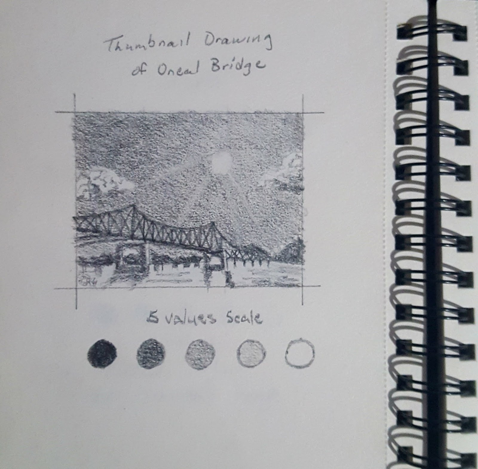
This is my reference thumbnail drawing done in prismacolor pencil.  The colors I used was purple, gray, lavender the tint of purple, baby blue, and a light dark aqua green.  If you are familiar with the color wheel these are secondary and tertiary color with one neutral which is gray.  By doing a thumbnail drawing design at the beginning it gives you a preview of which it my look like before totally committing to the color and composition.  However, in this piece later I deviated from the original composition and altered it some.                                                                                                                                                                                                                                                                                                                                                                                                                                         


I used canson watercolor paper and used liquitex matte super heavy gel which goes on white and can be mixed with paint.  In this case I applied the gel medium onto the paper.  I don't know if you can see the pattern or compostion drawn out on the surface with a pencil before there was paint applied. The gel gives the surface texture.                                                                                                                                                                                                                                                                                                                                                                                                                                                                                                                                                                                                                                                       


Next I added a light amount of  watercolors to the surface and I continued to add more color to darken it. I could have went dark to began with, but instead when I work with watercolors I start out light in tones of color.  You can see where the pattern or composition is going.                                                                                                                                                                                                                                                                                                                                                                                                                                                                                                                                              


I continue to add watercolors to the designated areas which was predetermined beforehand.  If you look closely you can see the texture coming through the colors.                                                                                                                                                                                                                                                                                                                                                                                                      
                                                                                                                                                                 

This is the final stage of the process as you can see there are colors that are broken up to produce more texture.  I added the same colors to the piece using only acrylic now.  I created my own stencil design out of watercolor paper which is stiff.  Your stencil has to be stiff enough to hold its pattern or design. I used a filbert bush and large round brush in the final stage.

Thank you all for taking the time to view my art blog.  If you are interested in my works of art please email me at deeweaver15@gmail.com.


Monday, June 1, 2015

Still Life Painting in Acylic


 Apple and Pitcher Still Life Painting


One Sunday afternoon this past summer I set up this still life of a apple and pitcher.  I had the purpose in mind to start do a painting of a still life.  I had been doing a few drawing of still lifes but this time I wanted to paint one instead.  When I set up most of my still lifes I use a dark back ground. I love the use of values and tones with the use of reflected light on the subjects.

Step 1 The Underpainting 


For the first step I began with a underpainting in a water down acrylic brown with a filbert brush.
I normally began with a drawing but in the case I chose not to. When I start my realistic paintings I use a filbert brush.  I just lay in the dark tones and block in the lighter values with a more watered down brown color.

Step 2 Adding Color 


Next I added color to the subject in the picture, this happened after I mixed the desired colors that were needed.  When I darken my colors I use blue or brown and sometimes I use black.  In this case, I took acylic red and darkened the tone with some blue.  When it came time for me to lighten the color I just used white.

Adding Color Continues


I repeated the same process with the blue sheet in the fact that I lighten with white and darkened it with black or brown.  I was still using the filbert brush during this stage of the painting.  However when it was time for me to paint the edges I used a flat brush and a liner brush to create a straight edge.

Finished Work


Sunday, March 29, 2015

Abstract Landscape Paintings

Distant Mountain

I wanted to create a landscape abstract seen with a unique color scheme.  Distant Mountain was a painting I created to show depth or distant using atmosphere value.  In other words, the further away something is in a landscape the lighter the value of it's color.  This painting was done in 2014 in September.  I used acrylic paint to produce this painting. My brushes was liner and filbert. I usually use a sponge when I make landscape paintings however this time I did not. The painting is 5 x 7 inches

Pink Vegetation

Here is another abstract painting produced on the same day but with a different color scheme.  If you notice the composition is different as well. In this painting I introduced a trail or a path.  This painting was produced in acrylic as well.  I used a liner brush, round brush, and filbert brush. Finally, the sky background I wanted to capture the transition of sky tones.  This painting is 5 x 7 inches.


Friday, March 6, 2015

Process of Acrylic Lemon Apple and Pepper Still Life


This is the finish work of a still I set up and painted in acrylic.  It is 11x14" done on watercolor paper.  It is a lemon, jalapeno pepper, and apple.


At this stage is the underpainting in which I used a brown acrylic wash to put down the values. I was was mapping out the dark and light values.  Basically this is the blueprint for the paint to follow on. The lighter tones had more water in the mix than the dark value. 

I began my still life painting with a simple line drawing at this point.  I used a sable brush to apply the lines.  The lighter value that dominates the entire paper was applied with a sponge brush.